Infographic: Occupy Wall Street – Ten Top Tens
New Civil Rights Movement reader Sean Lind emailed this to us. It’s his Occupy Wall Street infographic detailing ten top tens of the Occupy Movement. It’s quite impressive, actually. What do you think?
Lind writes,
What was started as a peaceful war-cry (by a Canadian magazine) has bloomed into a world-wide protest. Unfortunately the majority of the general public appear to be confused as to the purpose and end-goal of the movement in general. It’s for this reason we decided to put together this infographic.
This infographic takes a look at the top ten top 10’s of the #occupy movement, from speeches and photographs to news headlines from around the world.
And take a look at our other infographics, including one on one of our most popular topics ever:Â Maps: States That Allow Gay Marriage vs. States That Allow First Cousin Marriage.
http://www.cnntees.com/posts/ows/ows-infographic.html
Created by CNNTEES. Read the original blog here.
Enjoy this piece?
… then let us make a small request. The New Civil Rights Movement depends on readers like you to meet our ongoing expenses and continue producing quality progressive journalism. Three Silicon Valley giants consume 70 percent of all online advertising dollars, so we need your help to continue doing what we do.
NCRM is independent. You won’t find mainstream media bias here. From unflinching coverage of religious extremism, to spotlighting efforts to roll back our rights, NCRM continues to speak truth to power. America needs independent voices like NCRM to be sure no one is forgotten.
Every reader contribution, whatever the amount, makes a tremendous difference. Help ensure NCRM remains independent long into the future. Support progressive journalism with a one-time contribution to NCRM, or click here to become a subscriber. Thank you. Click here to donate by check.
 |
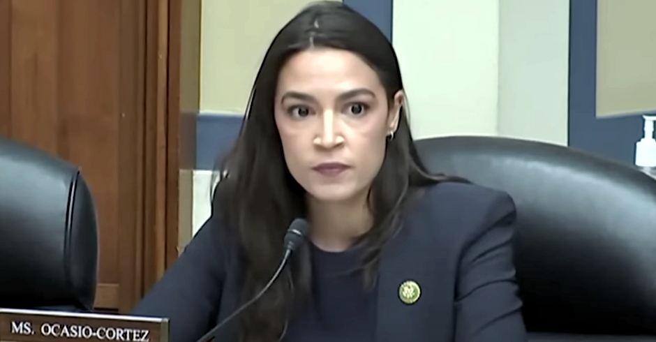
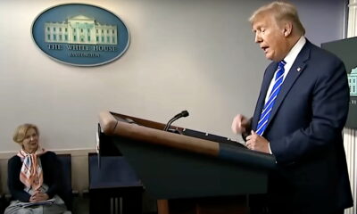
Democratic U.S. Rep. Alexandria Ocasio-Cortez is responding to Thursday’s U.S. Supreme Court hearing on Donald Trump’s claim he has “absolute immunity” from criminal prosecution because he was a U.S. president, and she delivered a strong warning in response.
Trump’s attorney argued before the nation’s highest court that the ex-president could have ordered the assassination of a political rival and not face criminal prosecution unless he was first impeached by the House of Representatives and then convicted by the Senate.
But even then, Trump attorney John Sauer argued, if assassinating his political rival were done as an “official act,” he would be automatically immune from all prosecution.
Justice Sonia Sotomayor, presenting the hypothetical, expressed, “there are some things that are so fundamentally evil that they have to be protected against.”
RELATED: Justices’ Views on Trump Immunity Stun Experts: ‘Watching the Constitution Be Rewritten’
“If the president decides that his rival is a corrupt person, and he orders the military, or orders someone to assassinate him, is that within his official acts for which he can get immunity?” she asked.
“It would depend on the hypothetical, but we can see that could well be an official act,” Trump attorney Sauer quickly replied.
SCOTUS Justice Sonia Sotomayor: “If the president … orders someone to assassinate [a rival], is that within his official acts for which he can get immunity?”
Trump attorney D. John Sauer: “It would depend on the hypothetical, but we can see that could well be an official act.” pic.twitter.com/RddEEYIUrR
— The Recount (@therecount) April 25, 2024
Sauer later claimed that if a president ordered the U.S. military to wage a coup, he could also be immune from prosecution, again, if it were an “official act.”
The Atlantic’s Tom Nichols, a retired U.S. Naval War College professor and an expert on Russia, nuclear weapons, and national security affairs, was quick to poke a large hole in that hypothetical.
“If the president suspends the Senate, you can’t prosecute him because it’s not an official act until the Senate impeaches …. Uh oh,” he declared.
RELATED: Justices Slam Trump Lawyer: ‘Why Is It the President Would Not Be Required to Follow the Law?’
U.S. Rep. Alexandria Ocasio-Cortez blasted the Trump team.
“The assassination of political rivals as an official act,” the New York Democrat wrote.
“Understand what the Trump team is arguing for here. Take it seriously and at face value,” she said, issuing a warning: “This is not a game.”
Marc Elias, who has been an attorney to top Democrats and the Democratic National Committee, remarked, “I am in shock that a lawyer stood in the U.S Supreme Court and said that a president could assassinate his political opponent and it would be immune as ‘an official act.’ I am in despair that several Justices seemed to think this answer made perfect sense.”
CNN legal analyst Norm Eisen, a former U.S. Ambassador and White House Special Counsel for Ethics and Government Reform under President Barack Obama, boiled it down: “Trump is seeking dictatorial powers.”
Watch the video above or at this link.
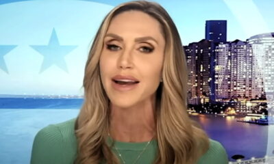
READ MORE: ‘They Will Have Thugs?’: Lara Trump’s Claim RNC Will ‘Physically Handle the Ballots’ Stuns
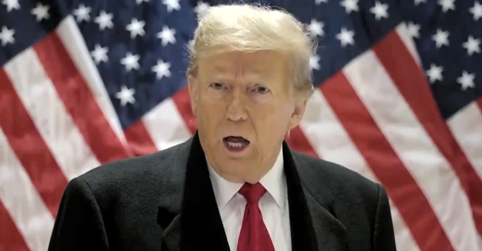
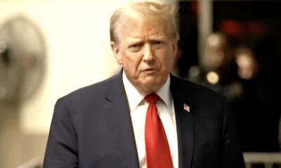
Legal experts appeared somewhat pleased during the first half of the Supreme Court’s historic hearing on Donald Trump’s claim he has “absolute immunity” from criminal prosecution because he was the President of the United States, as the justice appeared unwilling to accept that claim, but were stunned later when the right-wing justices questioned the U.S. Dept. of Justice’s attorney. Many experts are suggesting the ex-president may have won at least a part of the day, and some are expressing concern about the future of American democracy.
“Former President Trump seems likely to win at least a partial victory from the Supreme Court in his effort to avoid prosecution for his role in Jan. 6,” Axios reports. “A definitive ruling against Trump — a clear rejection of his theory of immunity that would allow his Jan. 6 trial to promptly resume — seemed to be the least likely outcome.”
The most likely outcome “might be for the high court to punt, perhaps kicking the case back to lower courts for more nuanced hearings. That would still be a victory for Trump, who has sought first and foremost to delay a trial in the Jan. 6 case until after Inauguration Day in 2025.”
Slate’s Mark Joseph Stern, who covers the courts and the law, noted: “This did NOT go very well [for Special Counsel] Jack Smith’s team. Thomas, Alito, and Kavanaugh think Trump’s Jan. 6 prosecution is unconstitutional. Maybe Gorsuch too. Roberts is skeptical of the charges. Barrett is more amenable to Smith but still wants some immunity.”
READ MORE: ‘To Do God Knows What’: Local Elections Official Reads Lara Trump the Riot Act
Civil rights attorney and Tufts University professor Matthew Segal, responding to Stern’s remarks, commented: “If this is true, and if Trump becomes president again, there is likely no limit to the harm he’d be willing to cause — to the country, and to specific individuals — under the aegis of this immunity.”
Noted foreign policy, national security and political affairs analyst and commentator David Rothkopf observed: “Feels like the court is leaning toward creating new immunity protections for a president. It’s amazing. We’re watching the Constitution be rewritten in front of our eyes in real time.”
“Frog in boiling water alert,” warned Ian Bassin, a former Associate White House Counsel under President Barack Obama. “Who could have imagined 8 years ago that in the Trump era the Supreme Court would be considering whether a president should be above the law for assassinating opponents or ordering a military coup and that *at least* four justices might agree.”
NYU professor of law Melissa Murray responded to Bassin: “We are normalizing authoritarianism.”
Trump’s attorney, John Sauer, argued before the Supreme Court justices that if Trump had a political rival assassinated, he could only be prosecuted if he had first been impeach by the U.S. House of Representatives then convicted by the U.S. Senate.
During oral arguments Thursday, MSNBC host Chris Hayes commented on social media, “Something that drives me a little insane, I’ll admit, is that Trump’s OWN LAWYERS at his impeachment told the Senators to vote not to convict him BECAUSE he could be prosecuted if it came to that. Now they’re arguing that the only way he could be prosecuted is if they convicted.”
READ MORE: Biden Campaign Hammers Trump Over Infamous COVID Comment
Attorney and former FBI agent Asha Rangappa warned, “It’s worth highlighting that Trump’s lawyers are setting up another argument for a second Trump presidency: Criminal laws don’t apply to the President unless they specifically say so…this lays the groundwork for saying (in the future) he can’t be impeached for conduct he can’t be prosecuted for.”
But NYU and Harvard professor of law Ryan Goodman shared a different perspective.
“Due to Trump attorney’s concessions in Supreme Court oral argument, there’s now a very clear path for DOJ’s case to go forward. It’d be a travesty for Justices to delay matters further. Justice Amy Coney Barrett got Trump attorney to concede core allegations are private acts.”
Due to Trump attorney’s concessions in Supreme Court oral argument, there’s now a very clear path for DOJ’s case to go forward.
It’d be a travesty for Justices to delay matters further.
Justice Amy Coney Barrett got Trump attorney to concede core allegations are private acts.⬇️ pic.twitter.com/F3qXi47ZT6
— Ryan Goodman (@rgoodlaw) April 25, 2024
NYU professor of history Ruth Ben-Ghiat, an expert scholar on authoritarians, fascism, and democracy concluded, “Folks, whatever the Court does, having this case heard and the idea of having immunity for a military coup taken seriously by being debated is a big victory in the information war that MAGA and allies wage alongside legal battles. Authoritarians specialize in normalizing extreme ideas and and involves giving them a respected platform.”
The Nation’s justice correspondent Elie Mystal offered up a prediction: “Court doesn’t come back till May 9th which will be a decision day. But I think they won’t decide *this* case until July 3rd for max delay. And that decision will be 5-4 to remand the case back to DC, for additional delay.”
Watch the video above or at this link.
READ MORE: ‘Doesn’t Care if Pregnant Women Live or Die’: Alito Slammed Over Emergency Abortion Remarks
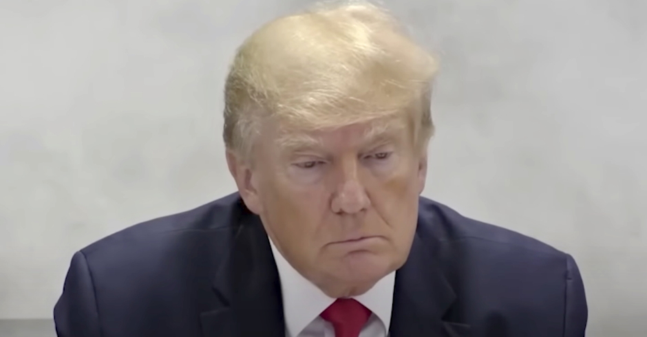
Justices on the U.S. Supreme Court hearing Donald Trump’s claim of absolute immunity early on appeared at best skeptical, were able to get his attorney to admit personal criminal acts can be prosecuted, appeared to skewer his argument a president must be impeached and convicted before he can be criminally prosecuted, and peppered him with questions exposing what some experts see is the apparent weakness of his case.
Legal experts appeared to believe, based on the Justices’ questions and statements, Trump will lose his claim of absolute presidential immunity, and may remand the case back to the lower court that already ruled against him, but these observations came during Justices’ questioning of Trump attorney John Sauer, and before they questioned the U.S. Dept. of Justice’s Michael Dreeben.
“I can say with reasonable confidence that if you’re arguing a case in the Supreme Court of the United States and Justices Alito and Sotomayor are tag-teaming you, you are going to lose,” noted attorney George Conway, who has argued a case before the nation’s highest court and obtained a unanimous decision.
But some are also warning that the justices will delay so Special Counsel Jack Smith’s prosecution of Trump will not take place before the November election.
READ MORE: ‘To Do God Knows What’: Local Elections Official Reads Lara Trump the Riot Act
“This argument still has a ways to go,” observed UCLA professor of law Rick Hasen, one of the top election law scholars in the county. “But it is easy to see the Court (1) siding against Trump on the merits but (2) in a way that requires further proceedings that easily push this case past the election (to a point where Trump could end this prosecution if elected).”
The Economist’s Supreme Court reporter Steven Mazie appeared to agree: “So, big picture: the (already slim) chances of Jack Smith actually getting his 2020 election-subversion case in front of a jury before the 2024 election are dwindling before our eyes.”
One of the most stunning lines of questioning came from Justice Ketanji Brown Jackson, who said, “If someone with those kinds of powers, the most powerful person in the world with the greatest amount of authority, could go into Office knowing that there would be no potential penalty for committing crimes. I’m trying to understand what the disincentive is, from turning the Oval Office into, you know, the seat of criminal activity in this country.”
READ MORE: ‘Doesn’t Care if Pregnant Women Live or Die’: Alito Slammed Over Emergency Abortion Remarks
She also warned, “If the potential for criminal liability is taken off the table, wouldn’t there be a significant risk that future presidents would be emboldened to commit crimes with abandon while they’re in office? It’s right now the fact that we’re having this debate because, OLC [Office of Legal Counsel] has said that presidents might be prosecuted. Presidents, from the beginning of time have understood that that’s a possibility. That might be what has kept this office from turning into the kind of crime center that I’m envisioning, but once we say, ‘no criminal liability, Mr. President, you can do whatever you want,’ I’m worried that we would have a worse problem than the problem of the president feeling constrained to follow the law while he’s in office.”
“Why is it as a matter of theory,” Justice Jackson said, “and I’m hoping you can sort of zoom way out here, that the president would not be required to follow the law when he is performing his official acts?”
Justice Jackson gets to the heart of it, “Why is it as a matter of theory, and I’m hoping you can sort of zoom way out here, that the president would not be required to follow the law when he is performing his official acts?” pic.twitter.com/9hMo948ufF
— Sarah Reese Jones (@PoliticusSarah) April 25, 2024
“So,” she added later, “I guess I don’t understand why Congress in every criminal statute would have to say and the President is included. I thought that was the sort of background understanding that if they’re enacting a generally applicable criminal statute, it applies to the President just like everyone else.”
Jackson: The most powerful person in the world could go into office knowing that there would be no potential penalty for committing crimes … I’m trying to understanding what the disincentive is from turning the Oval Office into the seat of criminal activity in this country pic.twitter.com/jC2yihYc54
— Acyn (@Acyn) April 25, 2024
Another critical moment came when Justice Elena Kagan asked, “If a president sells nuclear secrets to a foreign adversary, is that immune?”
Kagan: If a president sells nuclear secrets to a foreign adversary, is that immune?
Sauer: If it’s structured as an official act, he would have to be impeached and convicted first. pic.twitter.com/3JEgtW63Lz
— Acyn (@Acyn) April 25, 2024
Professor of law Jennifer Taub observed, “This is truly a remarkable moment. A former U.S. president is at his criminal trial in New York, while at the same time the U.S. Supreme Court is hearing his lawyer’s argument that he should be immune from prosecution in an entirely different federal criminal case.”
Watch the videos above or at this link.
READ MORE: ‘Blood on Your Hands’: Tennessee Republicans OK Arming Teachers After Deadly School Shooting

‘To Do God Knows What’: Local Elections Official Reads Lara Trump the Riot Act

Justices Slam Trump Lawyer: ‘Why Is It the President Would Not Be Required to Follow the Law?’

Justices’ Views on Trump Immunity Stun Experts: ‘Watching the Constitution Be Rewritten’

‘Assassination of Political Rivals as an Official Act’: AOC Warns Take Trump ‘Seriously’
‘Assassination of Political Rivals as an Official Act’: AOC Warns Take Trump ‘Seriously’
Justices’ Views on Trump Immunity Stun Experts: ‘Watching the Constitution Be Rewritten’
Justices Slam Trump Lawyer: ‘Why Is It the President Would Not Be Required to Follow the Law?’
‘To Do God Knows What’: Local Elections Official Reads Lara Trump the Riot Act

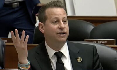
‘I Hope You Find Happiness’: Moskowitz Trolls Comer Over Impeachment Fail
 News3 days ago
‘Cutting Him to Shreds’: ‘Pissed’ Judge Tells Trump’s Attorney ‘You’re Losing All Credibility’

 News2 days ago
‘Blood on Your Hands’: Tennessee Republicans OK Arming Teachers After Deadly School Shooting
 News3 days ago
Biden Campaign Hammers Trump Over Infamous COVID Comment
 OPINION2 days ago
‘Doesn’t Care if Pregnant Women Live or Die’: Alito Slammed Over Emergency Abortion Remarks
 OPINION2 days ago
‘They Will Have Thugs?’: Lara Trump’s Claim RNC Will ‘Physically Handle the Ballots’ Stuns
 OPINION3 days ago
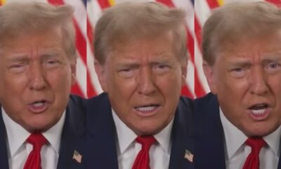
Trump Complains He’s ‘Not Allowed to Talk’ as He Gripes Live on Camera
 OPINION1 day ago
‘I Hope You Find Happiness’: Moskowitz Trolls Comer Over Impeachment Fail
 News2 days ago
Gag Order Breach? Trump Targeted Cohen in Taped Interview Hours Before Contempt Hearing